the exchange
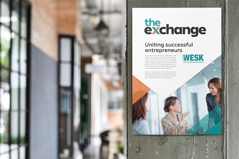
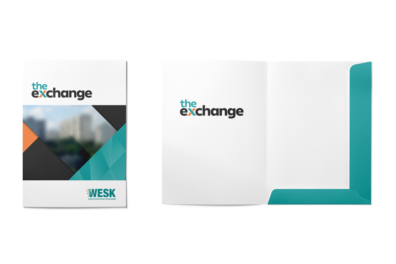
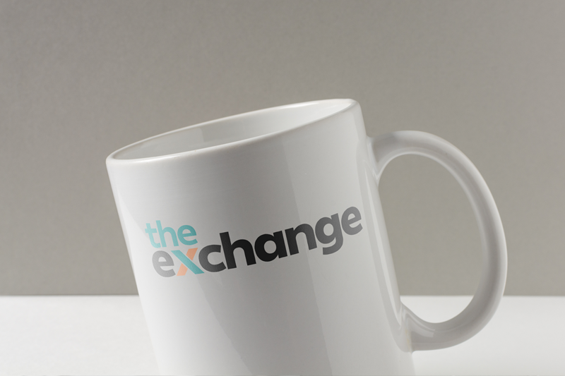
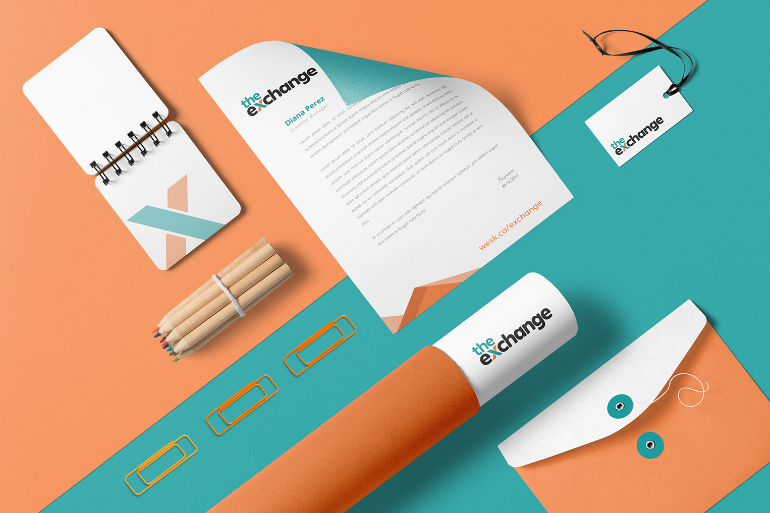
The Exchange by WESK is a springboard for female entrepreneurs to add value to their business through access to experts and a supportive network of advisors. This unapologetic and successful members-only program needed an identity that was modern, strong and influential. The logotype is cool and sophisticated with a point of emphasis on the "X" to draw interest and symbolize the connection for participants. As they say, X marks the spot.
- ClientWESK
- AgencyRock & Bloom
- IndustryEntrepreneurship
- ServicesDesign, Branding, Print


